Space
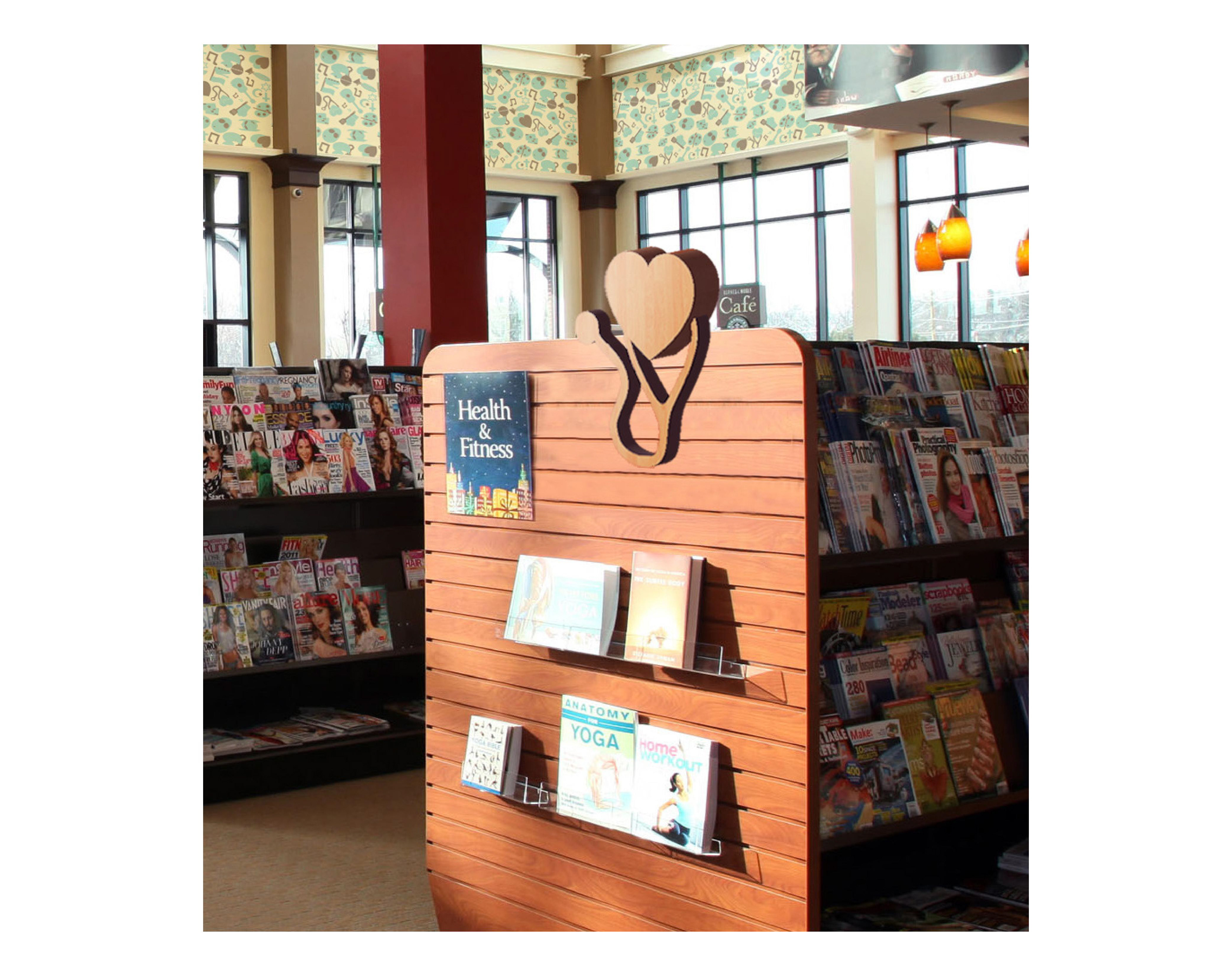
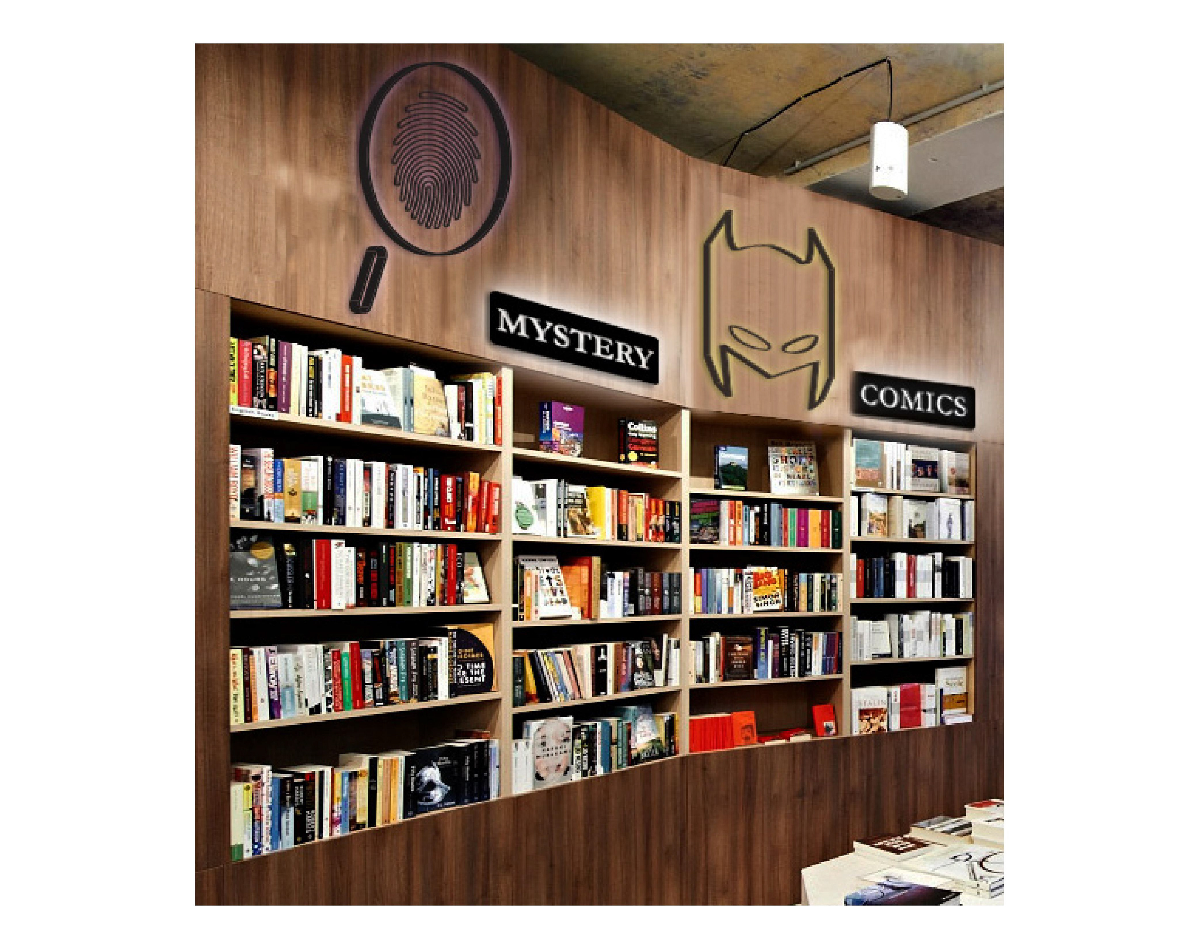
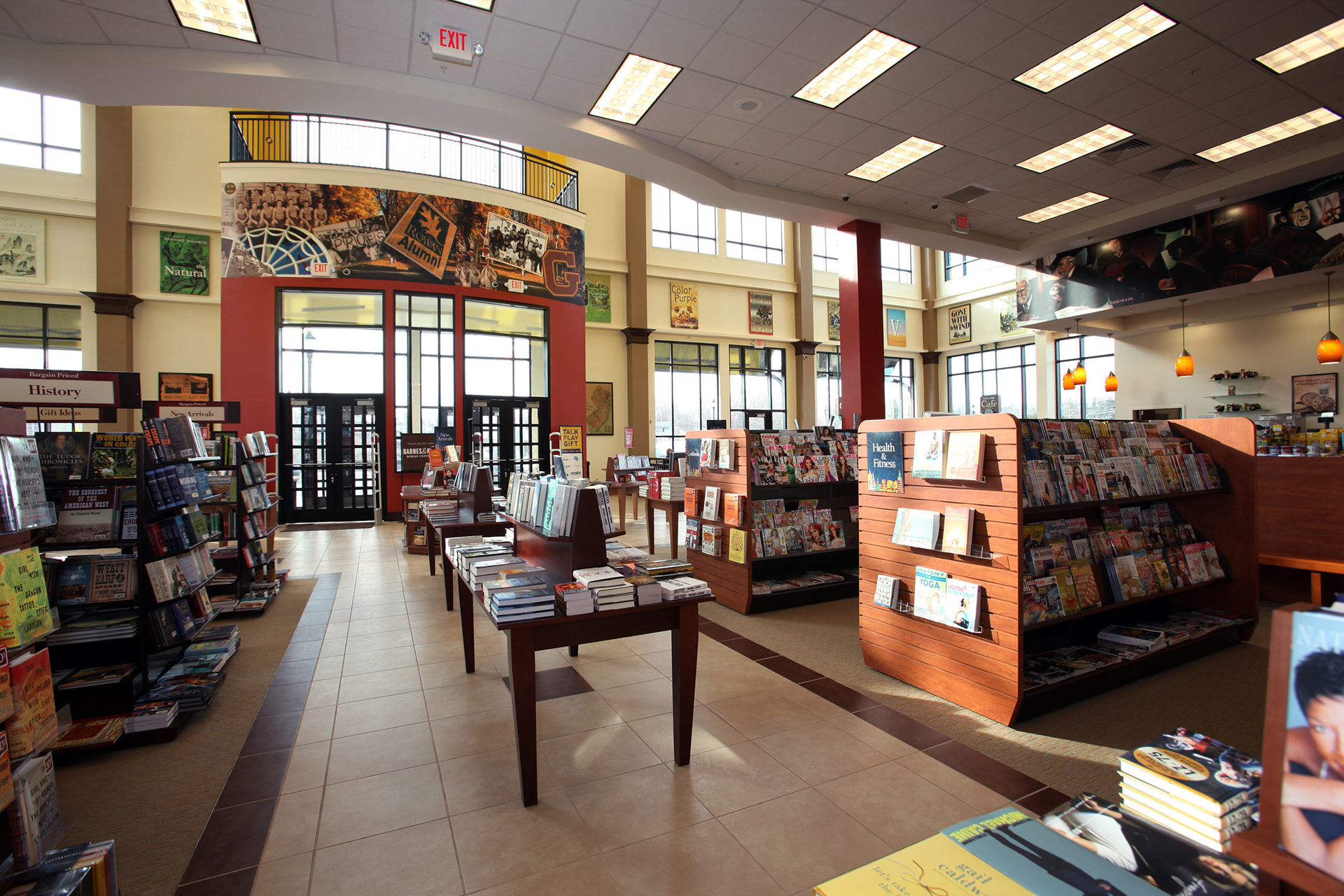
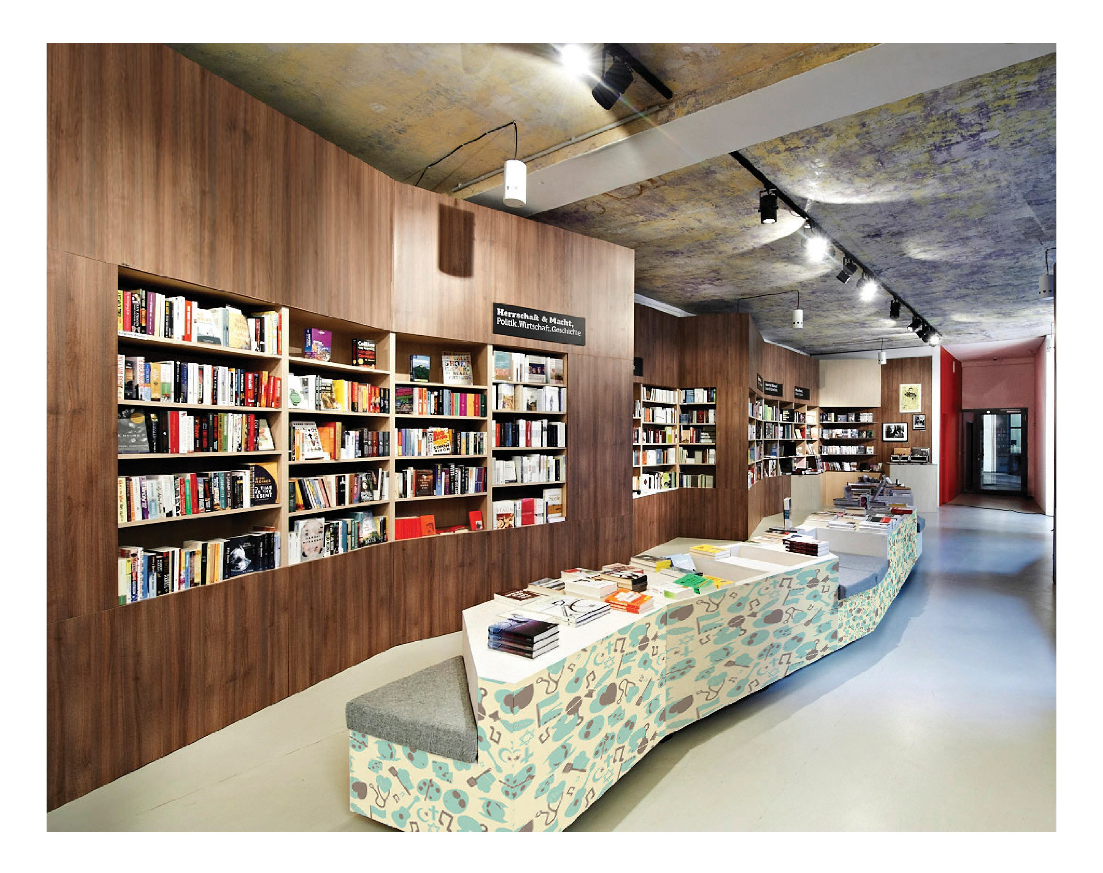
I want to focus on Barnes & Noble bookstores because they are one of the biggest book chains in the country, but also because they have a unique interior space. I believe the layout could be improved with the right pictograms. Currently, the sections are divided up with rectangular signs displaying the name of the sections. I think some pictograms could replace these signs and enhance the visual aesthetic of the store.
Styles
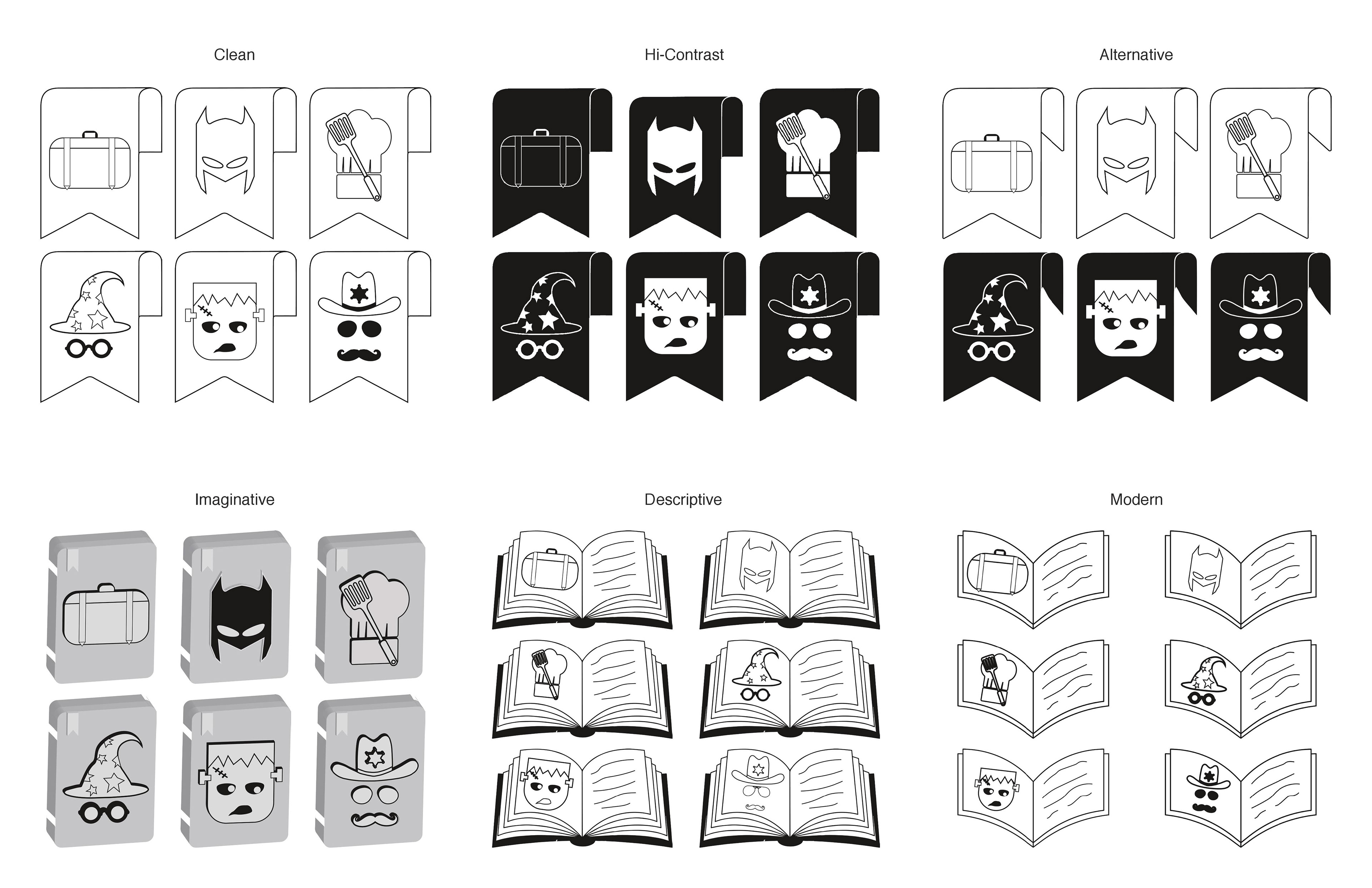
I experimented with a variety of different visual styles. The styles I designed focus on the background as a content holder as well as alternating black and white positions. Ultimately, I decided on the high-contrast style because it emphasized the content.
Original Twenty
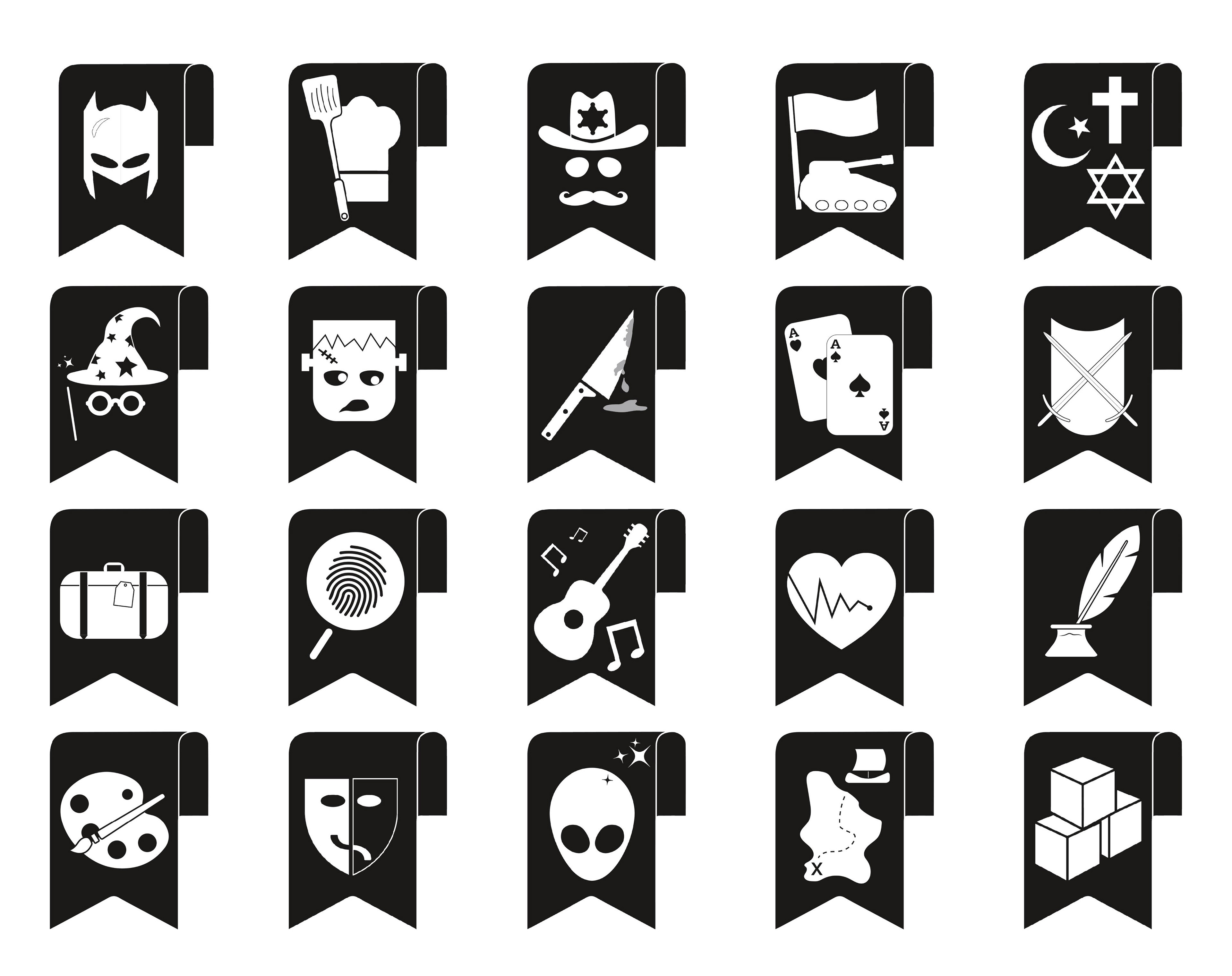
From the beginning, I wanted each of my pictograms to depict a particular genre. I also wanted to focus my pictograms primarily on characters from each genre, but realized that some characters overlap with other genres. I decided on a combination of characters and objects that are often associated with their particular genres. In my initial twenty pictograms, I chose to use a sharp black background that would emphasize the bright white content. The content either focuses on characters from the genre or objects related to the genre.
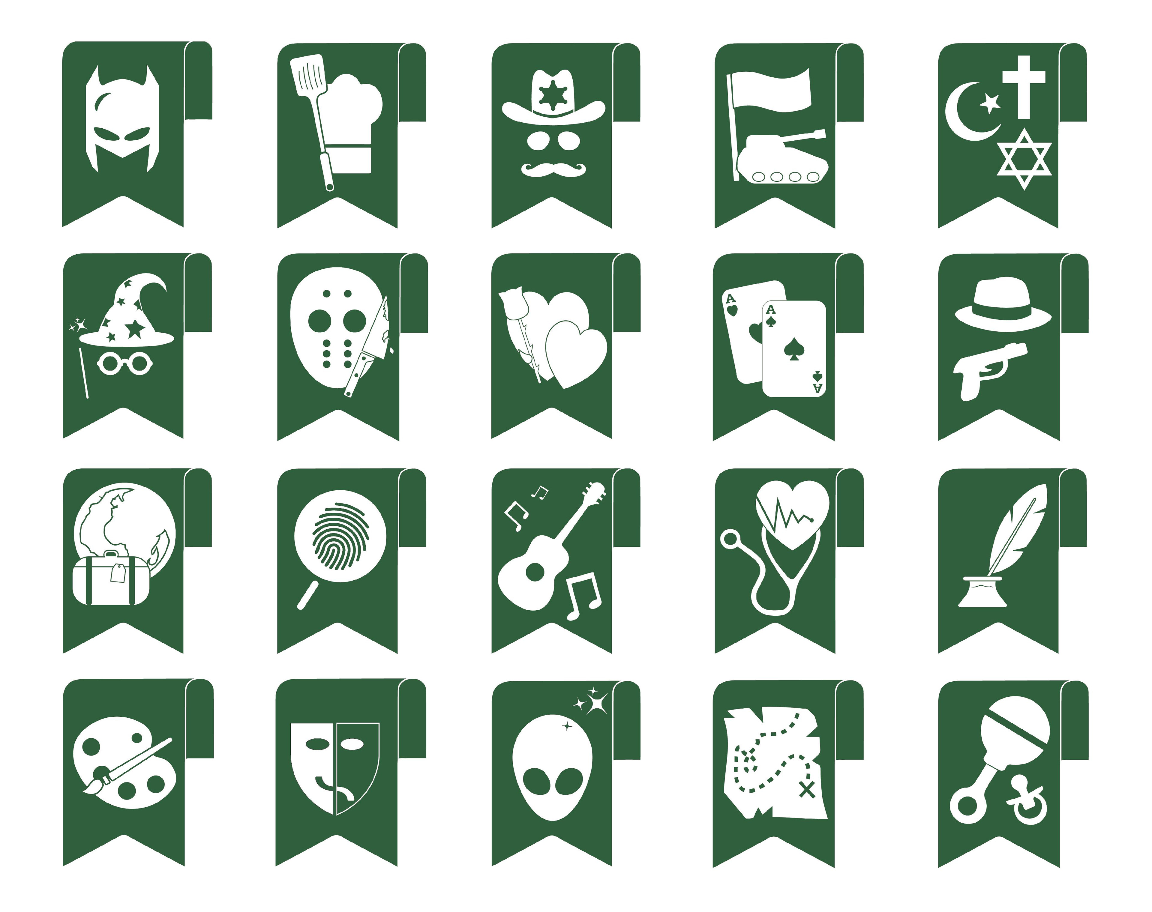
Final Twenty
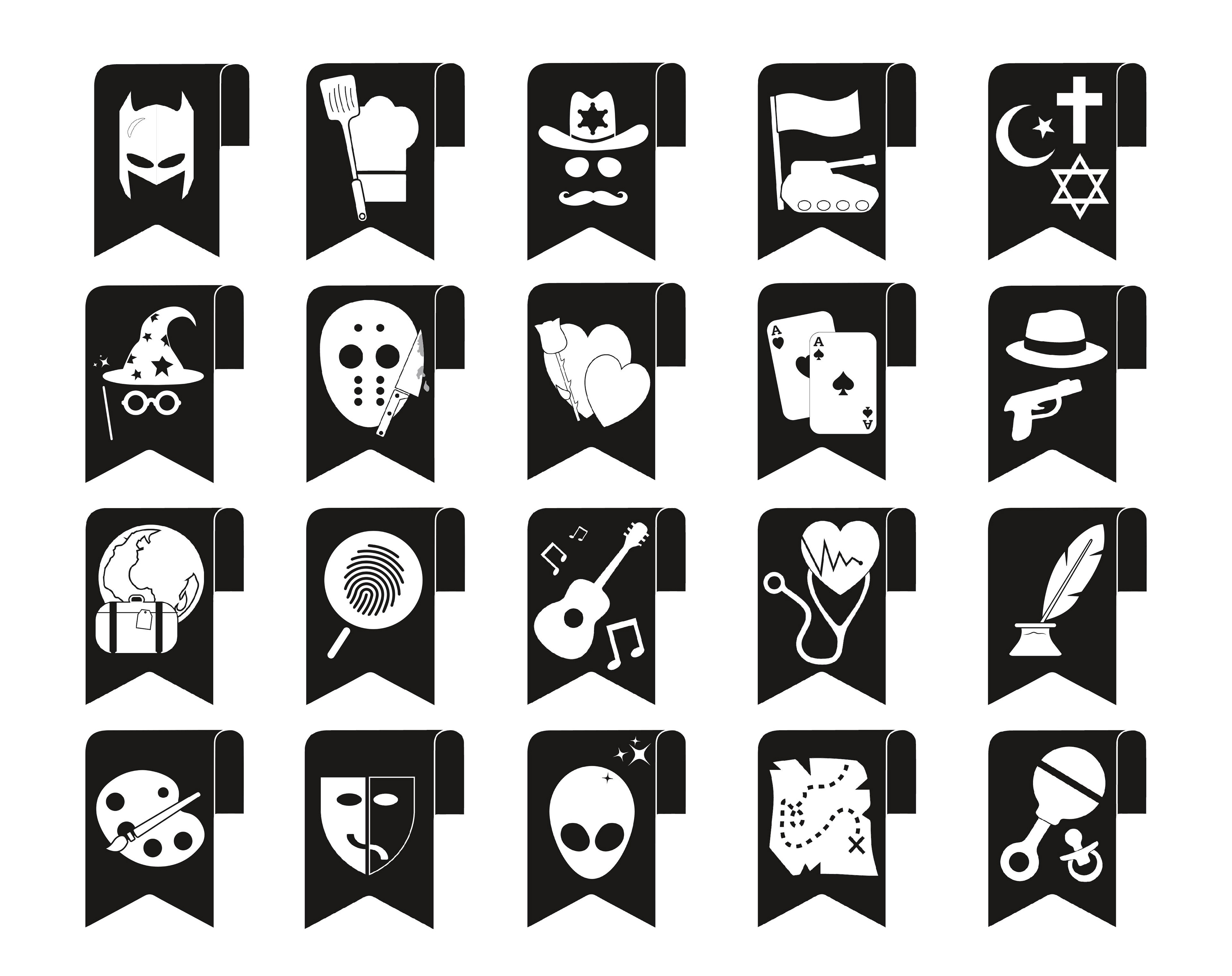
These are the final twenty pictograms after revisions based on a survey I conducted to determine the most recognizable.
One Color
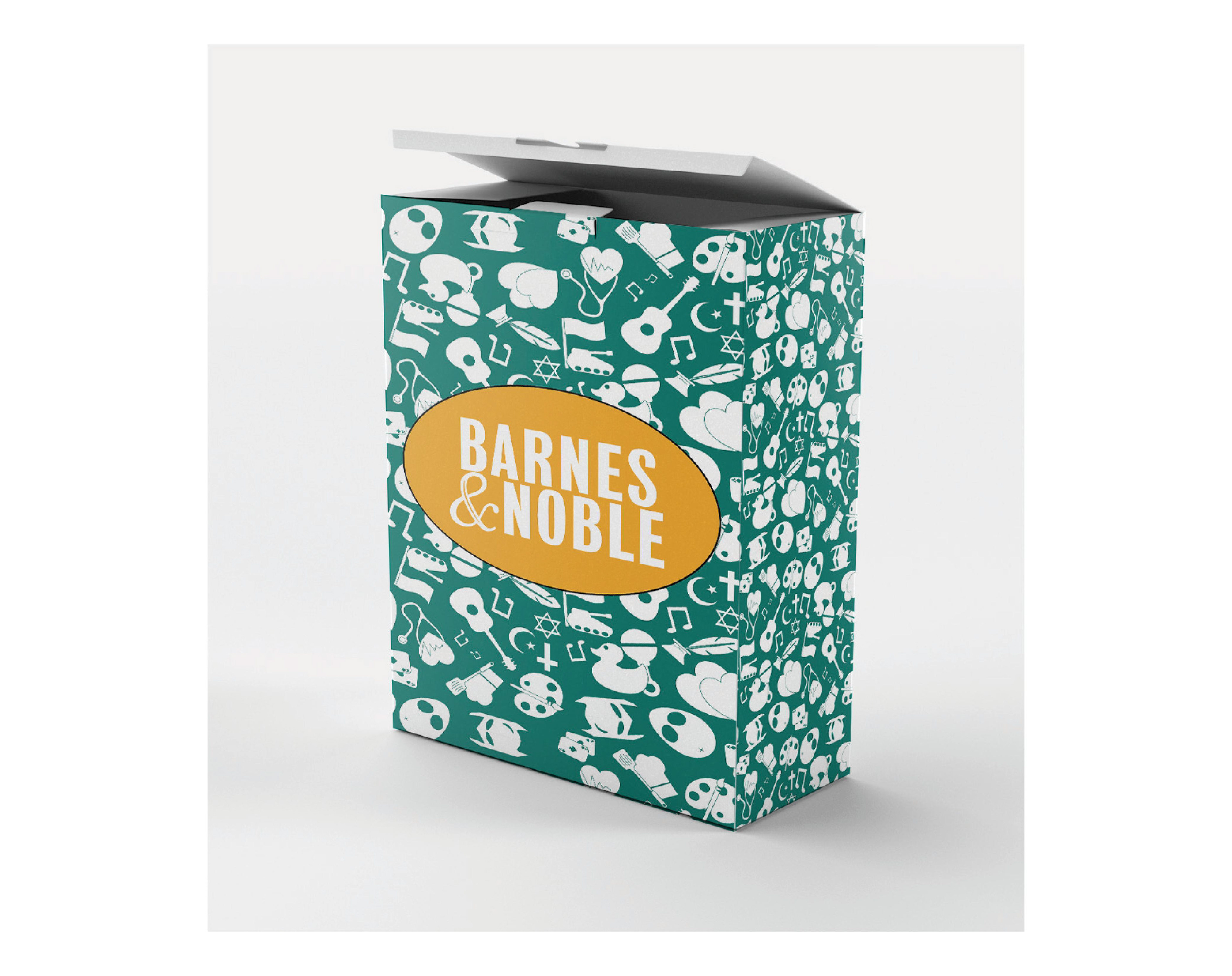
The dark green comes from the Barnes & Noble green found in their logo as well as throughout the interior of their stores. It’s a traditional color choice meant to reflect the current Barnes & Noble brand.
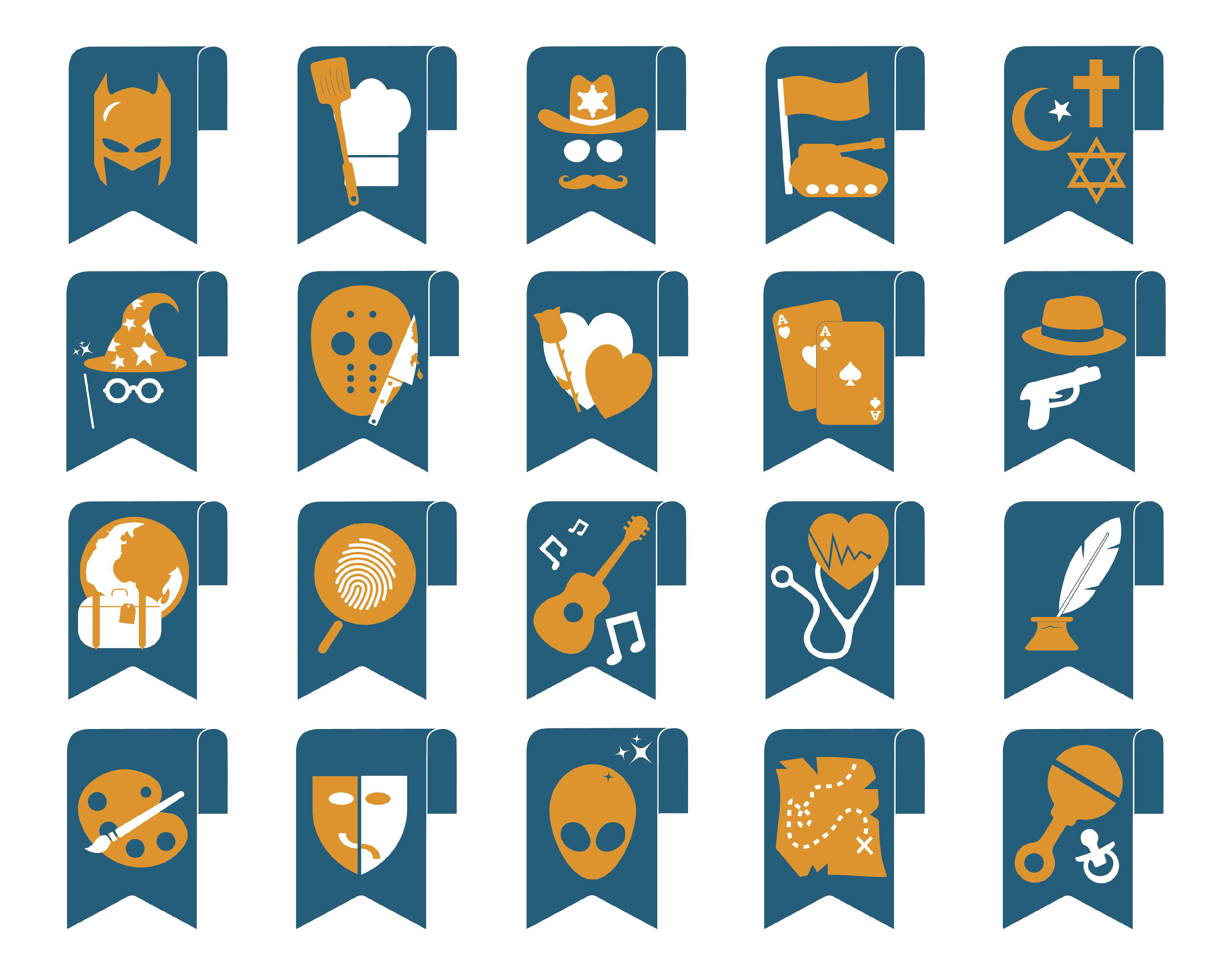
Multi-Color
I chose to focus on the dark orange highlight that appears in the Barnes & Noble logo. I was also inspired by the orange found in the Amazon Audible logo. The nightime blue is meant to represent the intelligence attained from reading books.
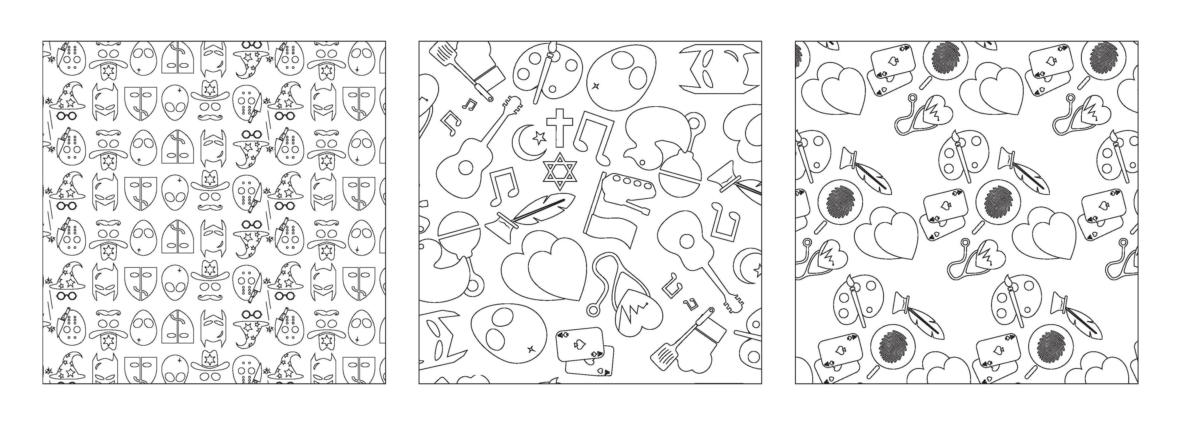
Patterns
I started by creating a geometric pattern that remained quite structured and static. I tried focusing only on the character pictograms, but realized that wouldn’t provide enough variety. The other detail I noticed was how my icons have a pretty wide variation in shape and size. This made geometric patterns more challenging. I decided on a random kinetic style. It gives the pattern more personality.
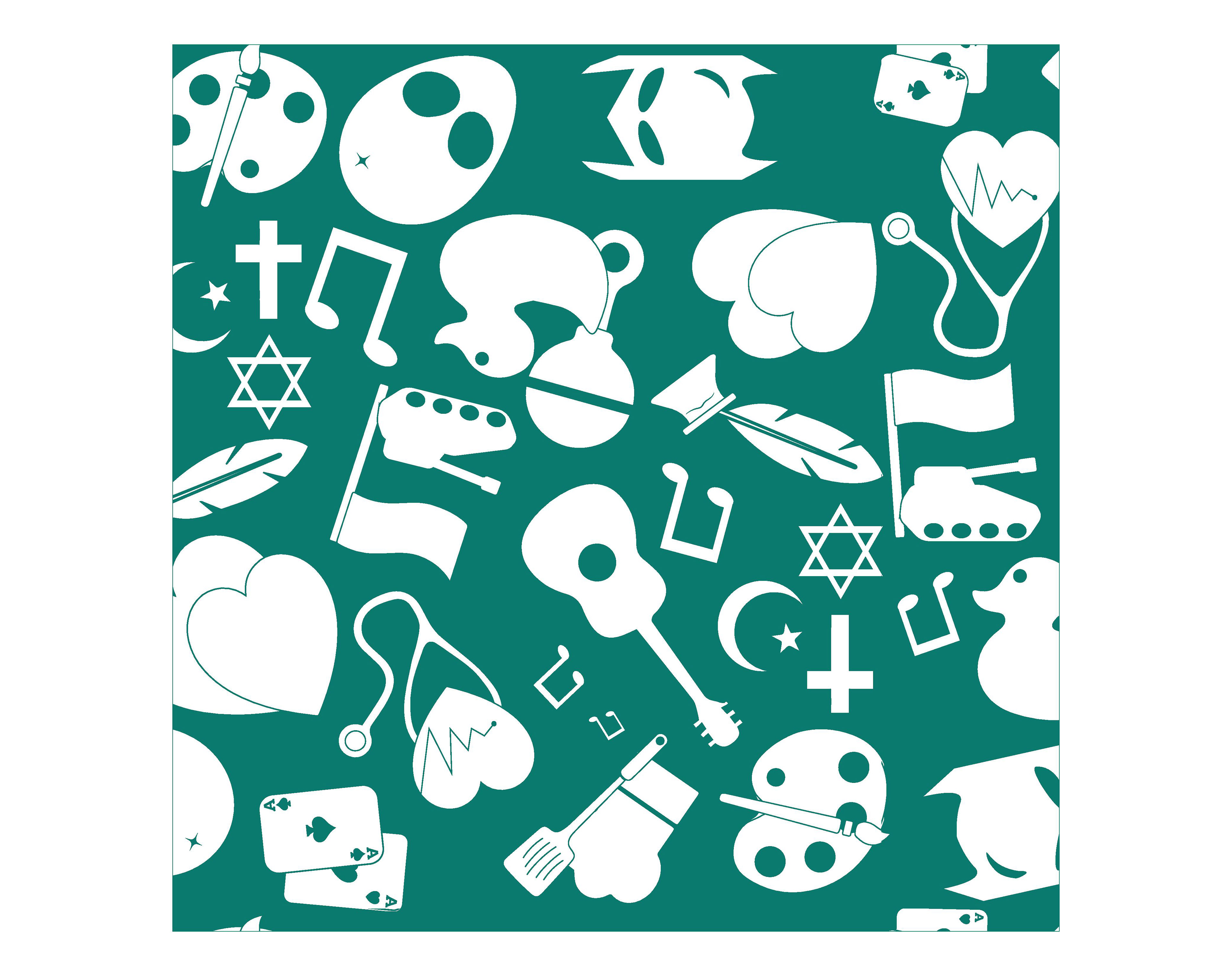
One Color Pattern
I didn’t want to use the same colors for both the patterns and the pictograms. I tested shades of the existing blue, green, and orange colors. Ultimately, I settled on a combination of blue and green to create a teal color as the background. I kept the pictograms white in order to emphasize the content.
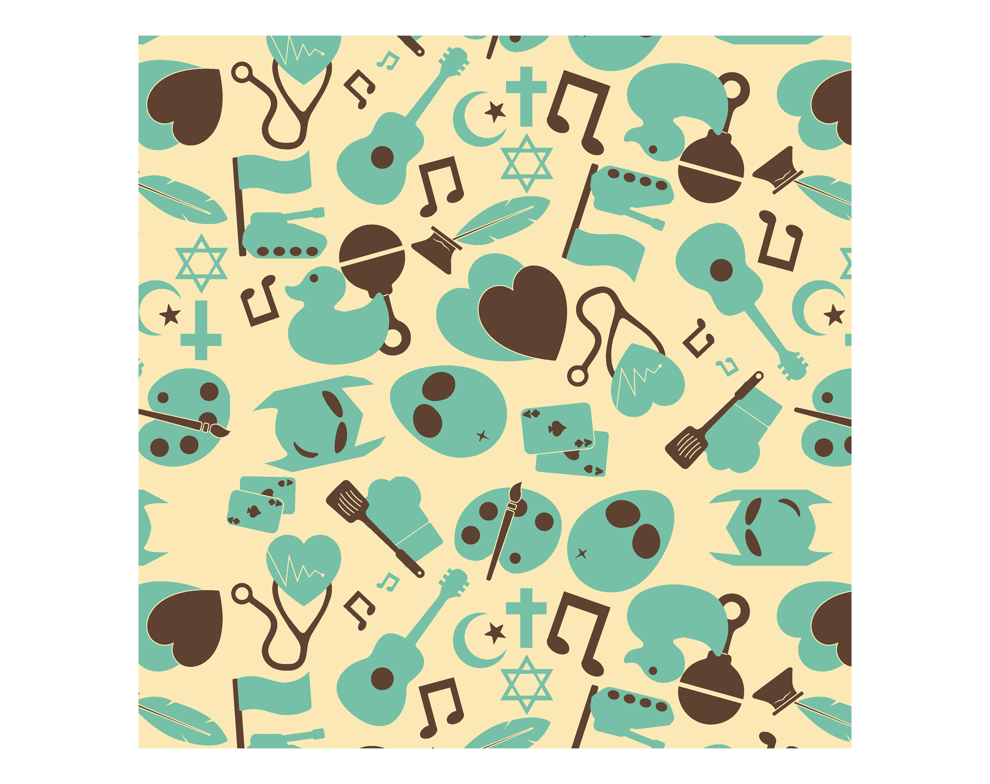
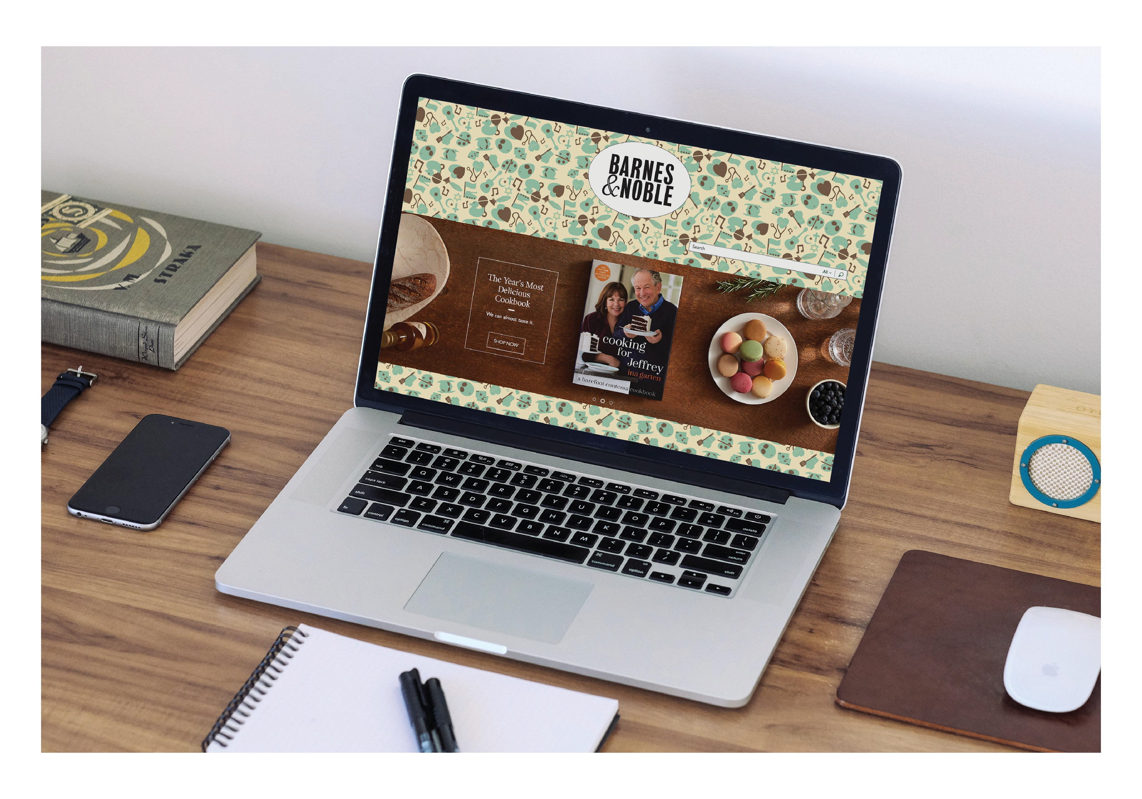
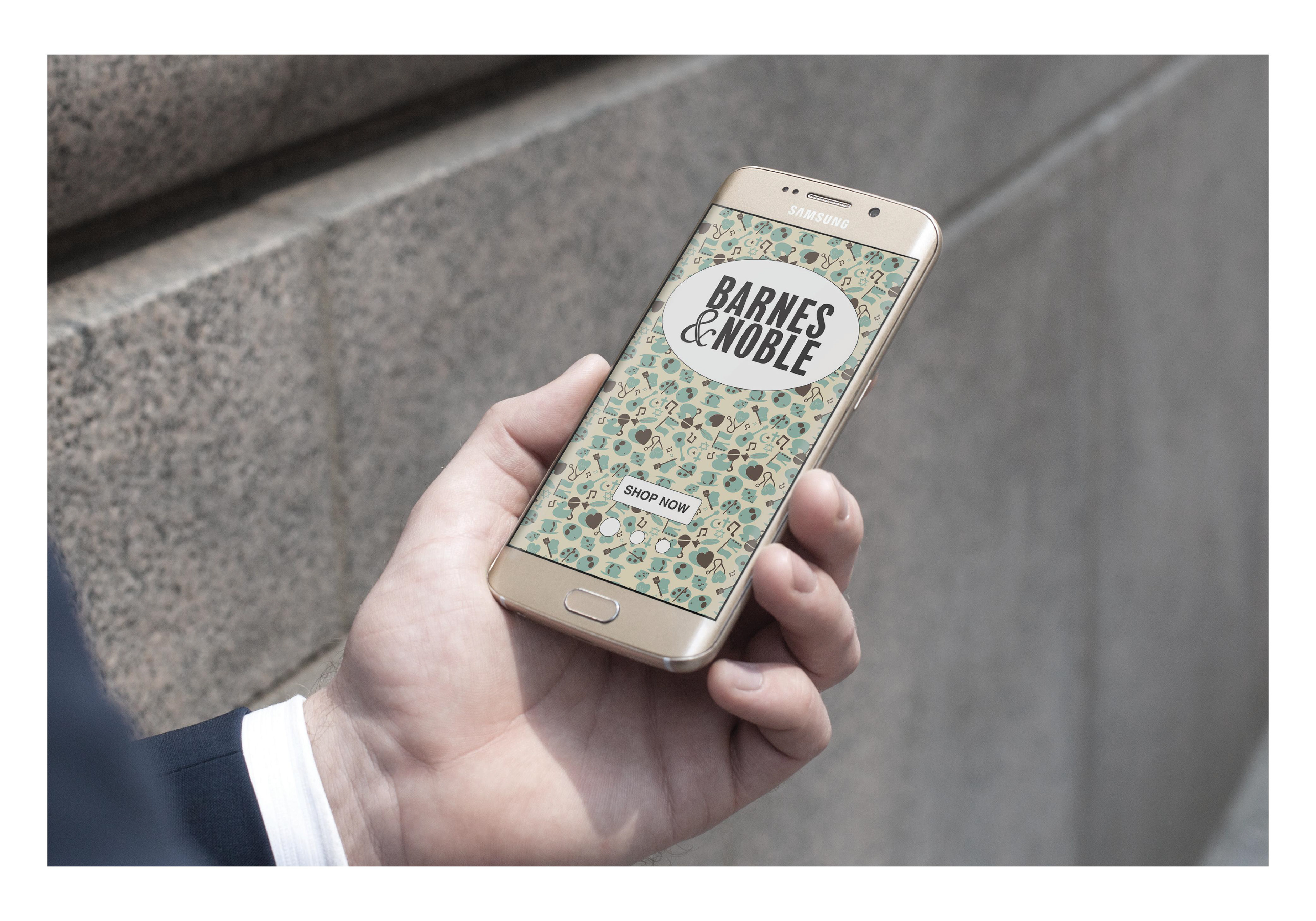
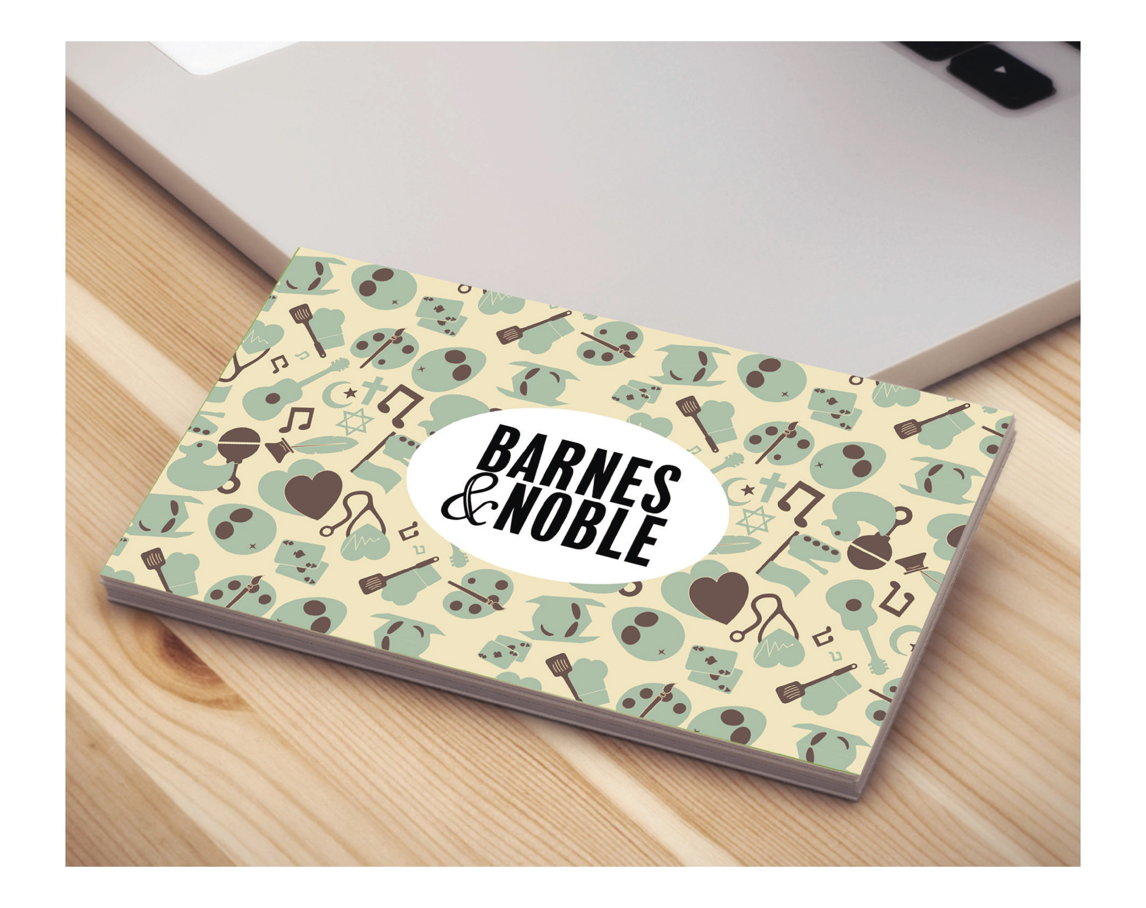
Multi-Color Pattern
I realized that Barnes & Noble bookstores have coffee shops in them, as do most bookstores. As a homage to the coffee shops, I created a cream, brown, and dark turquoise color palette.
Digital Applications
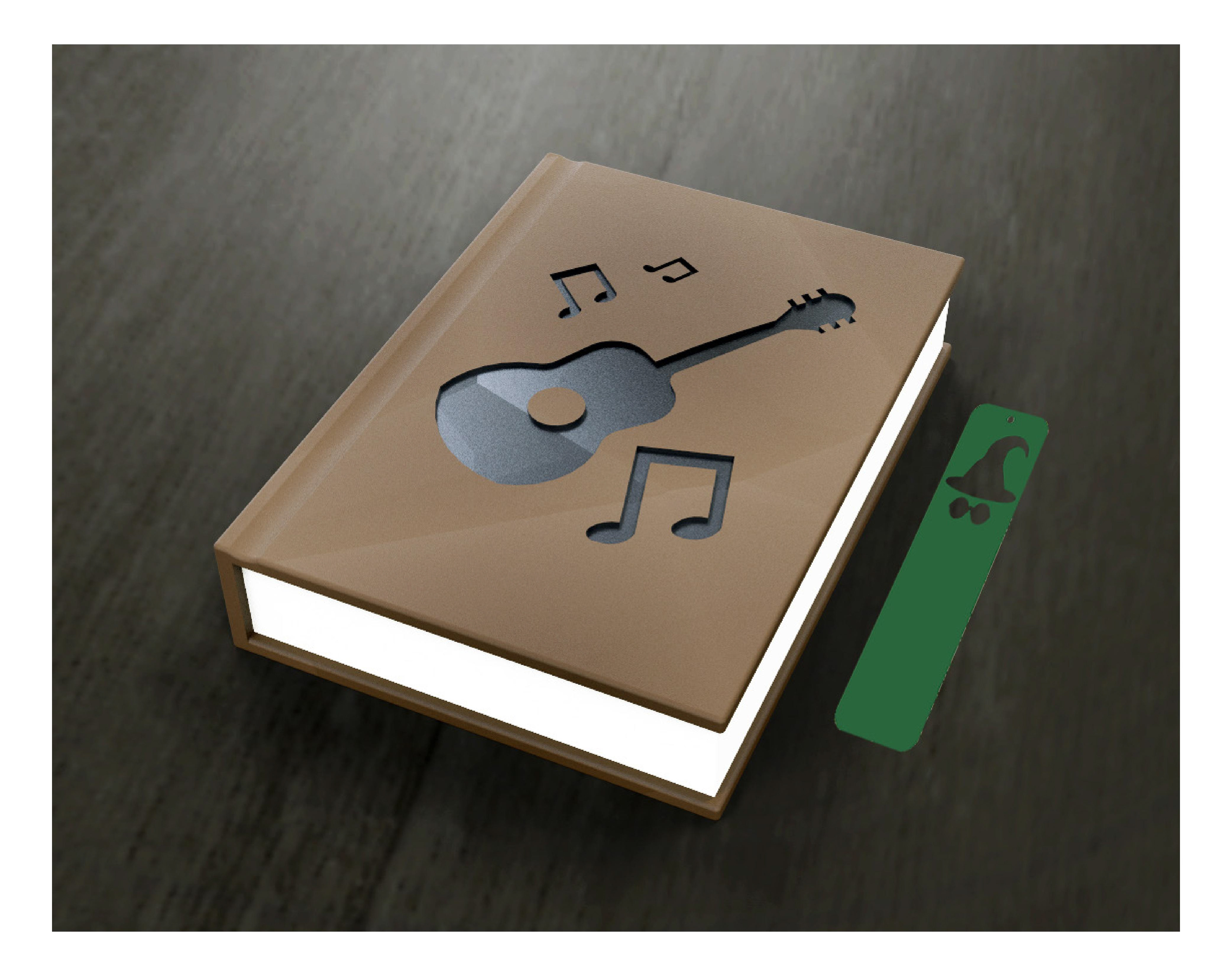
Physical Applications
Spatial Application
3D Applications